Covid-19 Health Disparities
Projects | | Links: Data Set | Tableau

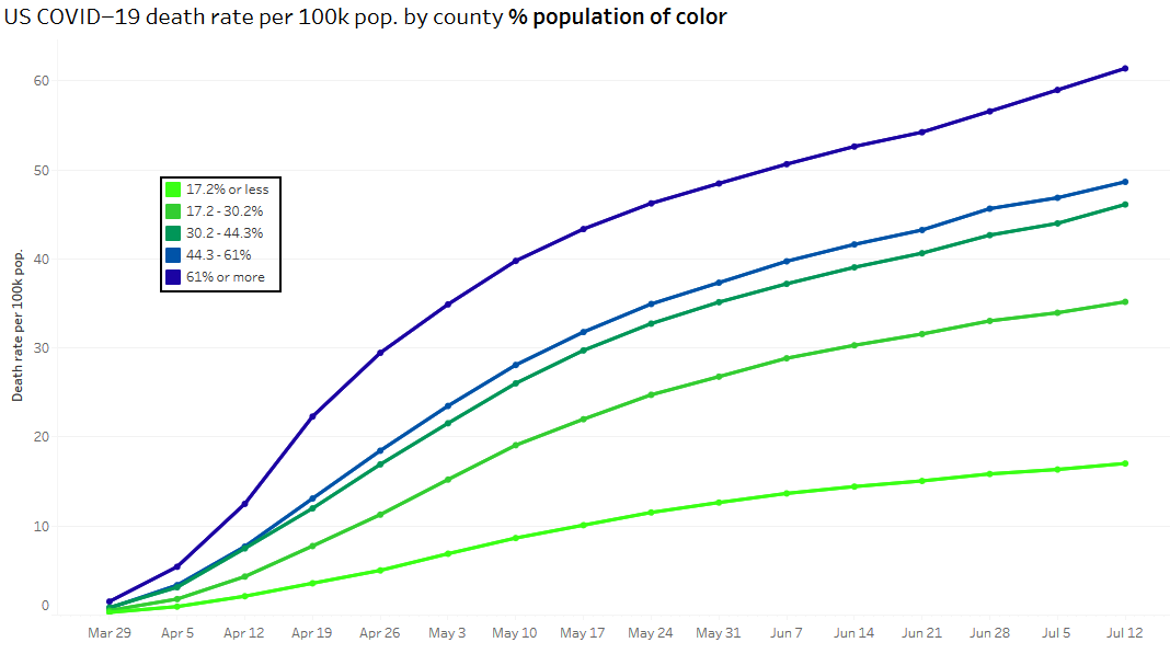
Inspired by The Public Health Disparities Geocoding Project, this graph compares COVID-19 death rate with various area-based socioeconomic measures (ABSMs).
Graph
Terms
- ABSM: Area-based socioeconomic measure. A broad term for measurements regarding the socioeconomic status of people within a given area. In this study counties are grouped together by different ABSMs, then compared with the death rate per 100,000 for the counties collectively. The measurements used for this research were:
- % below poverty: The percentage of the county that lives below the poverty line. The groupings were selected by the authors of the study.
- % population of color: The percentage of the county that are people of color, defined as not White Non-Hispanic.
- % crowded housing: The percentage of the county population that lives in crowded housing, defined as having more than one person per room in a home.
- ICE: Index of Concentration at the Extreme, which is “… the extent to which the population in a given area is concentrated at either extreme of a social metric and ranges from -1 (everyone in the worst category) to 1 (everyone in the best category)” [1]. In the first study the researchers set the extremes at high-income White populations versus low-income Black populations. In later analysis they included an ICE for high-income White Non-Hispanic populations versus low-income people of color. Both are included in this graph, as ICE (white/black + income) and ICE (white/poc + income) respectively.
- Death rate per 100k: The cumulative deaths in a county per 100,000 people. Not to be confused with the mortality rate of COVID-19 for an infected person, this is just the total population of the counties in a given grouping divided by the total number of COVID-19 related deaths within that grouping of counties.
Discussion
In April of this year, Drs. Jarvis T. Chen and Nancy Krieger published a study titled “Revealing the unequal burden of COVID-19 by income, race/ethnicity, and household crowding: US county vs ZIP code analyses” [1]. In this study they examine the death rates of COVID-19 for counties grouped by different socioeconomic measures, to determine how the pandemic may be impacting more disadvantaged groups, and where resources should be allocated to make sure resources go towards the most at risk. In this first study they only use the data for the cumulative deaths by April 16th, 2020. In the next published study, they do this again but for a timespan of a few weeks alongside some different analysis that standardized for age [2].
The aim of this project is to reproduce some of the analysis done previously, in addition to making the data more readily available and up-to-date. I’ve taken the same US Census data used originally, with the same computed quintiles or categories [4], while updating the USAFact data to range from March 29th to July 12th [5]. I hope to keep the data used for this graph up to date as USAFact publishes new records. The data is stored on Google Sheets, which is what the graph uses as the data source. I had to pivot the table provided by USAFact in order to use it with Tableau, the graphing software. The table pivoting is done via a Google Sheets script, so updating the data currently only requires uploading the new data to Google Sheets then running that script.
Future Work
- Automation script that checks USAFact every few days for new data, then updates the Google Sheet if there is new data
- Adding the analysis from more recent papers, either included the current graph or as seperate graphs. Such as:
References
[1] Chen JT, Krieger N. “Revealing the unequal burden of COVID-19 by income, race/ethnicity, and household crowding: US county vs ZIP code analyses.” Harvard Center for Population and Development Studies Working Paper Series, Volume 19, Number 1. April 21, 2020. https://tinyurl.com/ya44we2r.
[2] Chen JT, Waterman P Krieger N. “COVID-19 and the unequal surge in mortality rates in Massachusetts, by city/town and ZIP Code measures of poverty, household crowding, race/ethnicity,and racialized economic segregation.” Harvard Center for Population and Development Studies Working Paper Series, Volume 19, Number 2. May 9, 2020. https://tinyurl.com/y7qzot3l
[3] Chen JT, Waterman P Krieger N. “COVID-19 and the unequal surge in mortality rates in Massachusetts, by city/town and ZIP Code measures of poverty, household crowding, race/ethnicity,and racialized economic segregation.” Harvard Center for Population and Development Studies Working Paper Series, Volume 19, Number 3. June 12, 2020. https://www.hsph.harvard.edu/social-and-behavioral-sciences/2020/06/23/the-unequal-toll-of-covid-19-mortality-by-age-in-the-united-states-quantifying-racial-ethnic-disparities/
[4] “COVID-19 Resources.” The Public Health Disparities Geocoding Project Monograph, 15 May 2020. www.hsph.harvard.edu, https://www.hsph.harvard.edu/thegeocodingproject/covid-19-resources/
[5] “Coronavirus Locations: COVID-19 Map by County and State.” USAFacts.Org, 20 July 2020. https://usafacts.org/visualizations/coronavirus-covid-19-spread-map/